The project involved designing the officer poster and social media campaign for We Are Meant To Meet---a reality show focused on romantic lives for international students. The poster captures the dreamy and cinematic atmosphere of Los Angeles, symbolizing connection, youth, and romance. The project was initiated as part of a collaborative creative campaign where I served as both poster designer and social media strategist, responsible for managing online promotion and coordinating guest appearances. The deliverable included a promotional poster, social media assets, and a posting plan for multiple platforms.
My Role
-
Graphic Designer: created the main visual identity, including the poster and digital layouts and logo.
-
Social Media Manager: planned and executed teaser releases, engagement strategies, and platform scheduling.
-
Guest Coordinator: organized communication and logistics for the show’s international participants. I used Canva for visual creation, and Xiaohongshu and Douyin for social media management.
Concept & Problem & Goal
The main challenge was to design a poster that would appeal to both Chinese and international audiences while visually representing romance, youth, and also adding elements that can represent Los Angeles in this poster. I wanted the design to convey a sense of hopeful distance that the idea that love and friendship can bridge oceans.
The goal was to create a visually captivating and emotionally resonant poster that could serve as the central branding piece for the show's online marketing campaign. On the social media side the goal was to increase audience engagement before the first episode's release.
Design Process
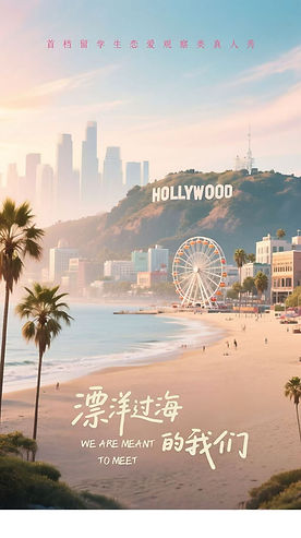
The design process began with an idea around the theme of "romance across distance." I drew inspiration from the La La Land film set in Los Angeles to become the representation of the location. However, I noticed the color tone of La La Land is too deep; I want symbols of dreams and encounters. I experimented with multiple color palettes, from vibrant pinks to soft golden hues. The Chinese title's brush-style typography was paired with a minimalist English subtitle (We Are Meant To Meet). This not only maintains global readability, but also creates two meanings of the reality show. The direct translation of the Chinese title is We Cross the Ocean, but I believe We Are Ment To Meet better expresses the main idea of this reality show. At the same time, I also need to coordinate guests. This required balancing time zones and communication between teams in the U.S. and China, that a key logistical challenge that strengthened my cross-cultural management skills.
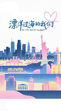


Previous Version
Color palette

Final Work & Result
The final poster visually represents a cinematic vision of connection. Soft sunlight over the Pacific coast and the symbolic Hollywood sign set the show’s international backdrop. The poster and coordinated promotion established a consistent, warm, and youthful brand tone for the show, and the experience deepened my understanding of visual storytelling and digital strategy in entertainment marketing. Finally, I led social media marketing and managed the official account, generating posts with 20K+ impressions and 4K+ comments, and driving strong audience engagement prior to filming.